pacman::p_load(sf, spdep, tmap, tidyverse, tmap, funModeling, rgdal, ClustGeo,
ggpubr, cluster, factoextra, NbClust, heatmaply,
corrplot, psych, GGally, palmerpenguins, patchwork)Take-home Exercise 2: Regionlization of Multivariate Water Point Attributes with Non-spatially Constrained and Spatially Constrained Clustering Methods
1.1 Setting the Scene
The process of creating regions is called regionalization. A regionlization is a special kind of clustering where the objective is to group observations which are similar in their statistical attributes, but also in their spatial location. In this sense, regionalization embeds the same logic as standard clustering techniques, but also applies a series of geographical constraints. Often, these constraints relate to connectivity: two candidates can only be grouped together in the same region if there exists a path from one member to another member that never leaves the region. These paths often model the spatial relationships in the data, such as contiguity or proximity. However, connectivity does not always need to hold for all regions, and in certain contexts it makes sense to relax connectivity or to impose different types of geographic constraints.
1.1.1 The Data
1.1.1.1 Apstial data
For the purpose of this assignment, data from WPdx Global Data Repositories will be used. There are two versions of the data. They are: WPdx-Basic and WPdx+. You are required to use WPdx+ data set. We will rename this file to “geo_export”.
1.1.1.2 Geospatial data
Nigeria Level-2 Administrative Boundary (also known as Local Government Area) polygon features GIS data will be used in this take-home exercise. The data can be downloaded either from The Humanitarian Data Exchange portal or geoBoundaries. We will use the file “nga_polnda_adm2_1m_salb”.
1.2 Objectives
In this take-home exercise you are required to regionalize Nigeria by using, but not limited to the following measures:
Total number of functional water points in LGA
Total number of nonfunctional water points in LGA
Percentage of functional water points
- equates to “number of functional water points in LGA / Total number of functional water points in LGA”
Percentage of non-functional water points
- equates to “number of nonfunctional water points in LGA” / “Total number of nonfunctional water points in LGA”
Percentage of main water point technology (i.e. Hand Pump)
- equates to “number of water points in LGA using Hand Pump” / “Total number of functional water points in LGA”
Percentage of usage capacity (i.e. < 1000, >=1000)
Percentage of usage capacity (< 1000) equates to “number of water points in LGA with usage capacity < 1000” / “Total number of functional water points in LGA”
Percentage of usage capacity (>= 1000) equates to “number of water points in LGA with usage capacity >= 1000” / “Total number of functional water points in LGA”
Percentage of rural water points
- “Percentage of is_urban == False in LGA” / “Total number of functional water points in LGA”
The areas within a region must be geographically connected (the spatial contiguity constraint).
1.2.1 Installing and loading R packages
Before we get started, it is important for us to install the necessary R packages into R and launch these R packages into R environment.
The R packages needed for this exercise are as follows:
Spatial data handling
- sf, rgdal and spdep
Attribute data handling
- tidyverse, especially readr, ggplot2, GGally,and dplyr
Choropleth mapping
- tmap
Multivariate data visualisation and analysis
- coorplot, ggpubr, heatmaply, palmerpenguins, and patchwork
Cluster analysis
cluster
ClustGeo
Rapid Exploratory Data Analysis
- funModeling
The code chunks below installs and launches these R packages into R environment.
Note: With tidyverse, we do not have to install readr, ggplot2 and dplyr packages separately. In fact, tidyverse also installs other very useful R packages such as tidyr.
1.3 Importing Geospatial Data
In this in-class data, two geospatial data sets will be used as mentioned in 1.1.1, they are:
geo_export
nga_polnda_adm2_1m_salb
1.3.1 Importing water point geospatial data
First, we are going to import the water point geospatial data (i.e. geo_export) by using the code chunk below.
wp = st_read(dsn = 'geodata',
layer = 'geo_export',
crs = 4326) %>%
filter(clean_coun == 'Nigeria')Things to learn from the code chunk above:
st_read()of sf package is used to import geo_export shapefile into R environment and save the imported geospatial data into simple feature data table.filter()of dplyr package is used to extract water point records of Nigeria.crs is set to 4326 which will be the same for nga in 1.3.2
Be warned: Avoid performing transformation if you plan to use
st_intersects()of sf package in the later stage of the geoprocessing. This is becausest_intersects()only works correctly if the geospatial data are in geographic coordinate system (i.e. wgs84)
Next, write_rds() of readr package is used to save the extracted sf data table (i.e. wp) into an output file in rds data format. The output file is called wp_nga.rds and it is saved in geodata sub-folder.
wp_nga = write_rds(wp, 'geodata/wp_nga_ex2.rds')st_crs(wp_nga)1.3.2 Importing Nigeria LGA boundary data
Now, we are going to import the LGA boundary data into R environment by using the code chunk below.
nga = st_read(dsn = 'geodata',
layer = 'nga_polnda_adm2_1m_salb',
crs = 4326)Thing to learn from the code chunk above.
st_read()of sf package is used to import nga_polnda_adm2_1m_salb shapefile into R environment and save the imported geospatial data into simple feature data table.- crs is set to 4326 which is the same for wp_nga
st_crs(nga)1.4 Data Wrangling
1.4.1 Sorting and comparing number of observations
This section involves sorting Nigeria LGA observation by column ADM2_CODE before comparing numbers of unique observations.
The code chunk below sort the dataset according to field ADM2_CODE
nga <- (nga[order(nga$ADM2_CODE), ])The code chunk below extract the unique rows with reference to field ADM2_CODE
uniq_nga <- unique(nga, by=nga$ADM2_CODE)After comparison, nga has 773 observations of 13 variables which is the same as as uniq_nga. Hence, we can conclude that there is no duplicate observations.
1.4.2 Re-coding NA values into string
In the code chunk below, replace_na() is used to recode all the NA values in status_cle field into Unknown so that we can so not need to omit rows with NA in the selected fields (status_cle and X_water_tec) and remove the need to create another subset of data solely comprising of “completed” data (rows without NA).
wp_nga <- read_rds("geodata/wp_nga_ex2.rds") %>%
mutate(status_cle = replace_na(status_cle, "Unknown")) %>%
mutate(X_water_tec = replace_na(X_water_tec, "Unknown"))1.4.3 EDA
In the code chunk below, freq() of funModeling package is used to display the distribution of status_cle field in wp_nga quickly.
freq(data=wp_nga,
input = 'status_cle')freq(data=wp_nga,
input = 'X_water_tec')1.5 Extracting Water Point Data
In this section, we will extract the water point records by using classes in status_cle field.
1.5.1 Extracting functional water points
In the code chunk below, filter() of dplyr is used to select functional water points. You will be able to understand what are considered as functional wpt in this take-home exercise.
wpt_func <- wp_nga %>%
filter(status_cle %in%
c("Functional",
"Functional but not in use",
"Functional but needs repair"))freq(data=wpt_func,
input = 'status_cle')1.5.2 Extracting non-functional water points
In the code chunk below, filter() of dplyr is used to select non-functional water points. You will be able to understand what are considered as nonfunctional wpt in this take-home exercise.
wpt_nonfunc <- wp_nga %>%
filter(status_cle %in%
c("Abandoned/Decommissioned",
"Abandoned",
"Non-Functional",
"Non functional due to dry season",
"Non-Functional due to dry season"))freq(data=wpt_nonfunc,
input = 'status_cle')1.5.3 Extracting water points with Unknown class
In the code chunk below, filter() of dplyr is used to select water points with unknown status.
wpt_unknown <- wp_nga %>%
filter(status_cle == "Unknown")1.5.4 Extracting water points using Hand Pump
We extract the rows with “Hand Pump” under the field X_water_tec
wpt_handpump <- wp_nga %>%
filter(X_water_tec == "Hand Pump")1.5.5 Extracting Rural water points
We extract the rows with “False” under the field is_urban
wpt_rural <- wp_nga %>%
filter(is_urban == "False")1.5.6 Extracting water points Usage Capacity < 1000
We first set the field usage_cap to integer. Subsequently, we extract rows where usage cap < 1000.
wp_nga$usage_cap <- as.integer(wp_nga$usage_cap)
wpt_usecapless1k <- wp_nga %>%
filter(usage_cap < 1000)1.5.7 Extracting water points Usage Capacity >= 1000
As the field usage_cap is already in integer, we can proceed to extract rows where usage cap >= 1000.
wpt_usecapequalormore1k <- wp_nga %>%
filter(usage_cap >= 1000)1.5.8 Performing Point-in-Polygon Count
st_intersects() return a list where the list contains the indexes of the point geometry that is found inside the polygon geometry.
lengths() returns the number of element inside the list which represent the number of water point within the polygon
nga_wp <- nga %>%
mutate(`total wpt` = lengths(
st_intersects(nga, wp_nga))) %>%
mutate(`wpt functional` = lengths(
st_intersects(nga, wpt_func))) %>%
mutate(`wpt non-functional` = lengths(
st_intersects(nga, wpt_nonfunc))) %>%
mutate(`wpt unknown` = lengths(
st_intersects(nga, wpt_unknown))) %>%
mutate(`wpt unknown` = lengths(
st_intersects(nga, wpt_unknown))) %>%
mutate(`wpt cap < 1000` = lengths(
st_intersects(nga, wpt_usecapless1k))) %>%
mutate(`wpt cap >= 1000` = lengths(
st_intersects(nga, wpt_usecapequalormore1k))) %>%
mutate(`wpt rural` = lengths(
st_intersects(nga, wpt_rural))) %>%
mutate(`wpt hand pump` = lengths(
st_intersects(nga, wpt_handpump)))1.5.9 Derive new variables using dplyr package
The unit of measurement of the values are number of household. Using these values directly will be bias by the underlying total number of total wpt. In general, the LGAs with relatively higher total number of water points will also have higher number of wpt functional, wpt rural, wpt hand pump and etc.
In order to overcome this problem, we will derive the percentage of each variable by using the code chunk below. The definitions are listed below:
Percentage of functional water points
pct functionalequates to “number of functional water points in LGA / Total number of functional water points in LGA”Percentage of non-functional water points
pct non-functionalequates to “number of nonfunctional water points in LGA” / “Total number of nonfunctional water points in LGA”Percentage of main water point technology (i.e. Hand Pump)
pct hand pumpequates to “number of water points in LGA using Hand Pump” / “Total number of functional water points in LGA”Percentage of usage capacity (< 1000)
pct cap < 1000equates to “number of water points in LGA with usage capacity < 1000” / “Total number of functional water points in LGA”Percentage of usage capacity (>= 1000)
pct cap >= 1000equates to “number of water points in LGA with usage capacity >= 1000” / “Total number of functional water points in LGA”Percentage of rural water points
pct rural“number of is_urban == False in LGA” / “Total number of functional water points in LGA”
nga_wp <- nga_wp %>%
mutate(`pct functional` = `wpt functional`/`total wpt`) %>%
mutate(`pct non-functional` = `wpt non-functional`/`total wpt`) %>%
mutate(`pct rural` = `wpt rural`/`total wpt`) %>%
mutate(`pct cap < 1000` = `wpt cap < 1000`/`total wpt`) %>%
mutate(`pct cap >= 1000` = `wpt cap >= 1000`/`total wpt`) %>%
mutate(`pct hand pump` = `wpt hand pump`/`total wpt`)Things to learn from the code chunk above:
mutate()of dplyr package is used to derive two fields namely pct_functional and pct_non-functional.
Now, you have the tidy sf data table subsequent analysis. We will save the sf data table into rds format.
write_rds(nga_wp, "geodata/wp_nga_ex2.rds")Before you end this section, please remember to delete away all the raw data. Notice that the only data file left is wp_nga_ex2.rds and it’s file size is around 2.1MB.
nga_wp <- read_rds("geodata/wp_nga_ex2.rds")The code chunk below selects the required fields and assign them to nga_wp_Ex2
nga_wp_Ex2 <- select(nga_wp, -c(`wpt rural`,`wpt cap < 1000`,`wpt hand pump`,`CNTRY_CODE`,`CNTRY_NAME`,`ADM1_NAME`,`ADM1_CODE`,`ADM2_NAME`,`HRname`,`HRpcode`,`HRparent`,`Shape_Leng`,`ADM2_New`,`Shape_Area`,`wpt unknown`,`wpt cap >= 1000`))All NA in data is replaced with 0 as to prevent instances where division by 0 occurs.
nga_wp_Ex2[is.na(nga_wp_Ex2)] = 0summary(nga_wp_Ex2) ADM2_CODE total wpt wpt functional wpt non-functional
Length:773 Min. : 0.0 Min. : 0.00 Min. : 0.00
Class :character 1st Qu.: 44.0 1st Qu.: 16.00 1st Qu.: 12.00
Mode :character Median : 92.0 Median : 45.00 Median : 33.00
Mean :122.9 Mean : 67.46 Mean : 41.66
3rd Qu.:169.0 3rd Qu.: 87.00 3rd Qu.: 60.00
Max. :846.0 Max. :716.00 Max. :264.00
pct functional pct non-functional pct rural pct cap < 1000
Min. :0.0000 Min. :0.0000 Min. :0.0000 Min. :0.0000
1st Qu.:0.3226 1st Qu.:0.2115 1st Qu.:0.5826 1st Qu.:0.4118
Median :0.4746 Median :0.3514 Median :0.8614 Median :0.6800
Mean :0.4983 Mean :0.3600 Mean :0.7288 Mean :0.6138
3rd Qu.:0.6802 3rd Qu.:0.5000 3rd Qu.:1.0000 3rd Qu.:0.8750
Max. :1.0000 Max. :1.0000 Max. :1.0000 Max. :1.0000
pct cap >= 1000 pct hand pump geometry
Min. :0.0000 Min. :0.0000 MULTIPOLYGON :773
1st Qu.:0.1198 1st Qu.:0.1875 epsg:4326 : 0
Median :0.3077 Median :0.5147 +proj=long...: 0
Mean :0.3694 Mean :0.4943
3rd Qu.:0.5614 3rd Qu.:0.7805
Max. :1.0000 Max. :1.0000 2.1 Exploratory Data Analysis (EDA)
2.1.1 EDA using statistical graphics
The following code chunk sets the theme for aesthetic purposes
theme_set(theme_bw(16))We can plot the distribution of the variables by using appropriate Exploratory Data Analysis (EDA) as shown in the code chunk below.
Histogram is useful to identify the overall distribution of the data values (i.e. left skew, right skew or normal distribution).
We will proceed to find the distribution of wpt functional, wpt non-functional, pct functional, pct non-functional, pct rural, pct handpump, pct cap < 1000, pct cap >= 1000 using the code chunks below.
wpt_func_hist <-ggplot(data=nga_wp_Ex2,
aes(x=`wpt functional`)) +
geom_histogram(bins=20,
color="black",
fill="light blue") +
labs(title = "Distribution of\nwpt functional") +
theme(plot.title=element_text(hjust=0.5))We also use shapiro.test to test for normality in the code chunk below. Should the p-value is greater than 0.05, the data is normal. If it is below 0.05, the data deviate from a normal distribution.
shapiro.test(nga_wp_Ex2$`wpt functional`)
Shapiro-Wilk normality test
data: nga_wp_Ex2$`wpt functional`
W = 0.70314, p-value < 2.2e-16wpt_nonfunc_hist <-ggplot(data=nga_wp_Ex2,
aes(x=`wpt non-functional`)) +
geom_histogram(bins=20,
color="black",
fill="light blue") +
labs(title = "Distribution of\nwpt non-functional") +
theme(plot.title=element_text(hjust=0.5))shapiro.test(nga_wp_Ex2$`wpt non-functional`)
Shapiro-Wilk normality test
data: nga_wp_Ex2$`wpt non-functional`
W = 0.88598, p-value < 2.2e-16wpt_pctfunc_hist <-ggplot(data=nga_wp_Ex2,
aes(x=`pct functional`)) +
geom_histogram(bins=20,
color="black",
fill="light blue") +
labs(title = "Distribution of\npct functional") +
theme(plot.title=element_text(hjust=0.5))shapiro.test(nga_wp_Ex2$`pct functional`)
Shapiro-Wilk normality test
data: nga_wp_Ex2$`pct functional`
W = 0.98358, p-value = 1.276e-07wpt_pctnonfunc_hist <-ggplot(data=nga_wp_Ex2,
aes(x=`pct non-functional`)) +
geom_histogram(bins=20,
color="black",
fill="light blue") +
labs(title = "Distribution of\npct non-functional") +
theme(plot.title=element_text(hjust=0.5))shapiro.test(nga_wp_Ex2$`pct non-functional`)
Shapiro-Wilk normality test
data: nga_wp_Ex2$`pct non-functional`
W = 0.98492, p-value = 3.83e-07wpt_pctrural_hist <-ggplot(data=nga_wp_Ex2,
aes(x=`pct rural`)) +
geom_histogram(bins=20,
color="black",
fill="light blue") +
labs(title = "Distribution of\npct rural") +
theme(plot.title=element_text(hjust=0.5))wpt_handpump_hist <-ggplot(data=nga_wp_Ex2,
aes(x=`pct hand pump`)) +
geom_histogram(bins=20,
color="black",
fill="light blue") +
labs(title = "Distribution of\npct hand pump") +
theme(plot.title=element_text(hjust=0.5))wpt_usecapless1k_hist <-ggplot(data=nga_wp_Ex2,
aes(x=`pct cap < 1000`)) +
geom_histogram(bins=20,
color="black",
fill="light blue") +
labs(title = "Distribution of\npct usecap < 1000") +
theme(plot.title=element_text(hjust=0.5))wpt_usecapequalormore1k_hist <-ggplot(data=nga_wp_Ex2,
aes(x=`pct cap >= 1000`)) +
geom_histogram(bins=20,
color="black",
fill="light blue") +
labs(title = "Distribution of\npct usecap >= 1000") +
theme(plot.title=element_text(hjust=0.5))The distribution of the variables are displayed visually using the code chunks below.
wpt_func_hist + wpt_nonfunc_hist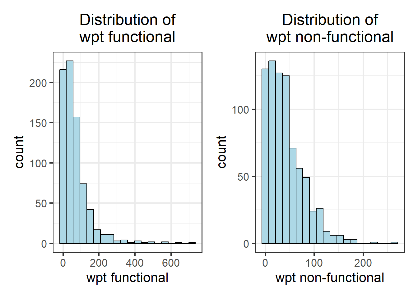
wpt_pctfunc_hist + wpt_pctnonfunc_hist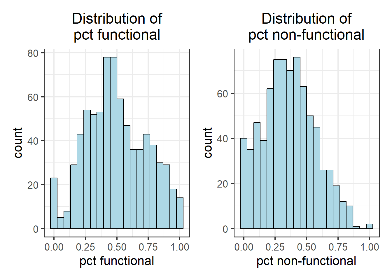
wpt_pctrural_hist + wpt_handpump_hist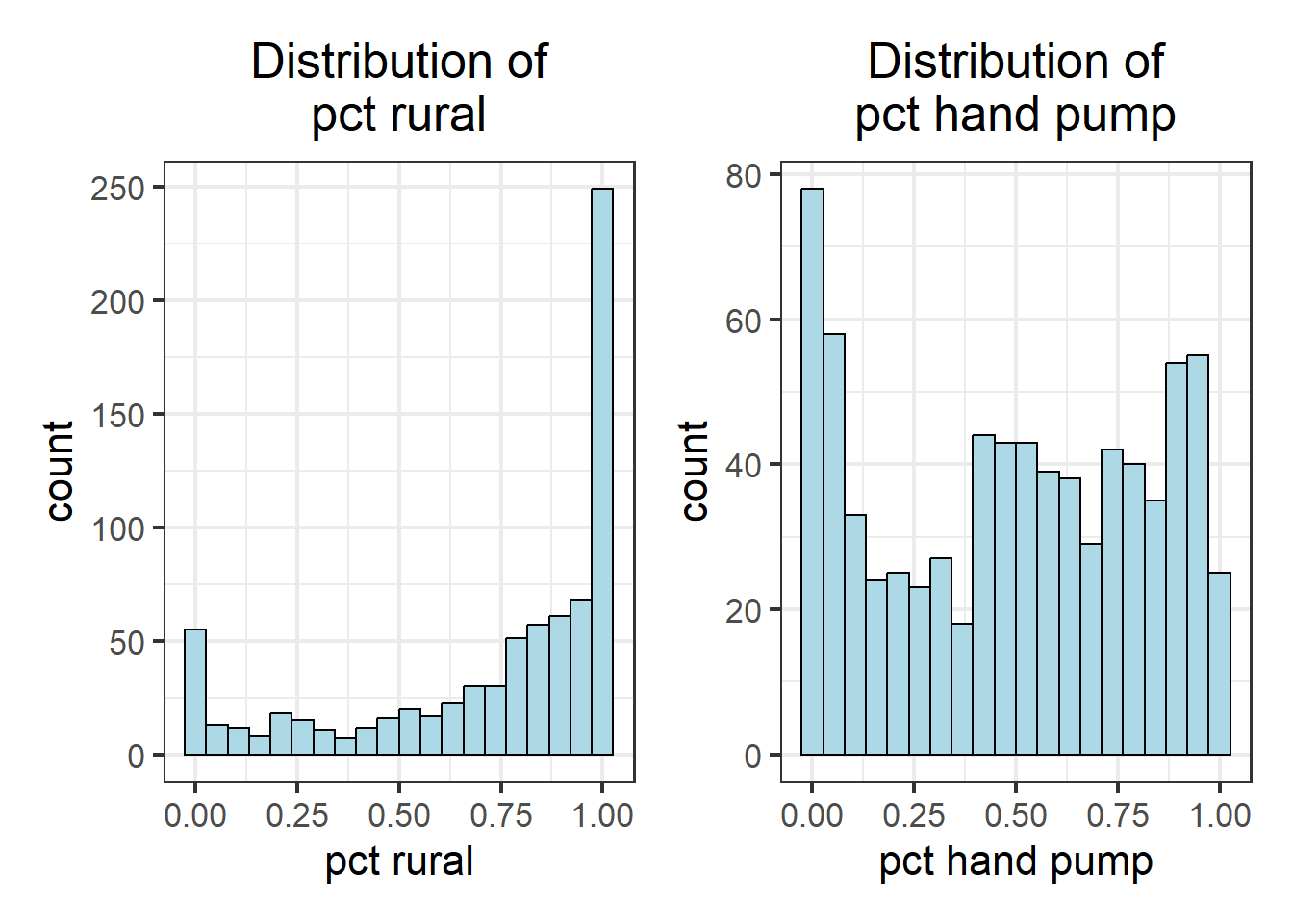
wpt_usecapless1k_hist + wpt_usecapequalormore1k_hist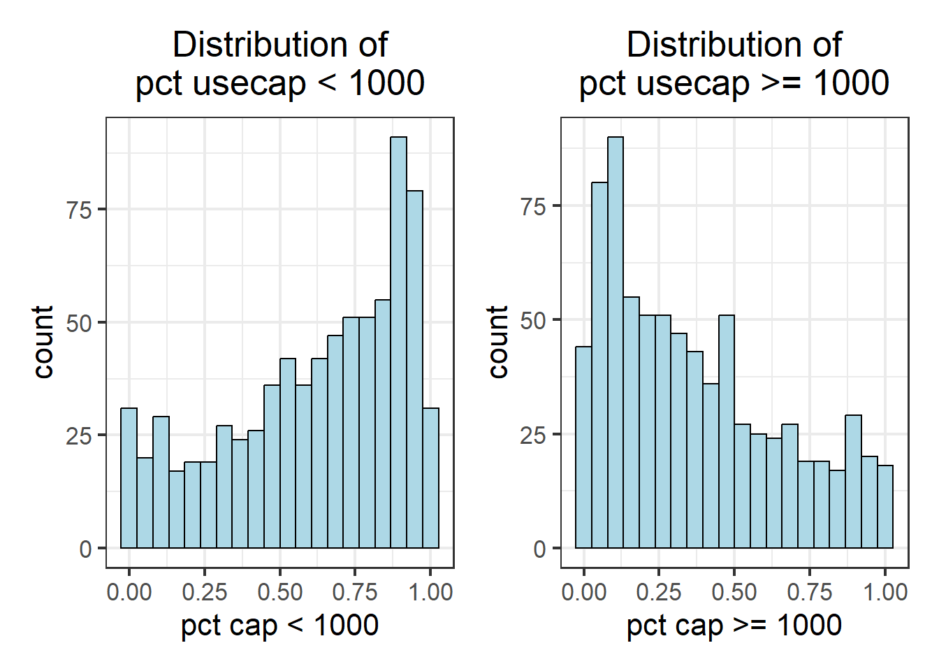
As observed, not all variables have a normal distribution. Hence we are unable to to use z-standardization for these variables. We will proceed to use Min-Max scaling.
2.2.1 EDA using choropleth map
2.2.1.1 Preparing a choropleth map
To have a quick look at the distribution of total water points in Nigeria vs percentage of water points using Hand pump at Local Government Area level, a choropleth map will be prepared.
The code chunks below are used to create an interactive choropleth by using codes in tmap package.
tmap_mode("view")tmap mode set to interactive viewingtotal_wpt_plot <- tm_shape(nga_wp_Ex2) +
tm_fill("total wpt",
style="jenks",
title = "total wpt") +
tm_legend(legend.position = c("right", "bottom")) +
tm_borders("black", lwd = 0.3, alpha = 0.3) +
tm_layout(outer.margins=0, asp=0) +
tm_view(set.zoom.limits = c(5,10))
pct_handpump_plot <- tm_shape(nga_wp_Ex2) +
tm_fill("pct hand pump",
style="jenks",
title = "pct hand pump") +
tm_legend(legend.position = c("right", "bottom")) +
tm_borders("black", lwd = 0.3, alpha = 0.3) +
tm_layout(outer.margins=0, asp=0) +
tm_view(set.zoom.limits = c(5,10))
tmap_arrange (total_wpt_plot, pct_handpump_plot, asp = 1, ncol = 2, sync = TRUE)legend.postion is used for plot mode. Use view.legend.position in tm_view to set the legend position in view mode.legend.postion is used for plot mode. Use view.legend.position in tm_view to set the legend position in view mode.tmap_mode is set back to “plot” mode.
tmap_mode("plot")tmap mode set to plotting3.1 Correlation Analysis
Before we perform cluster analysis, it is important for us to ensure that the cluster variables are not highly correlated.
In this section, you will learn how to use corrplot.mixed() function of corrplot package to visualise and analyse the correlation of the input variables. We need to remove the geometry column so that we can use cor(). The geometry column can be removed by using st_set_geometry(NULL) as shown in the code chunk below.
nga_wp_Ex2_DG = nga_wp_Ex2 %>%
st_set_geometry(NULL)cluster_vars.cor = cor(nga_wp_Ex2_DG[,(3:10)])
corrplot.mixed(cluster_vars.cor,
lower = "ellipse",
upper = "number",
tl.pos = "lt",
diag = "l",
tl.col = "black")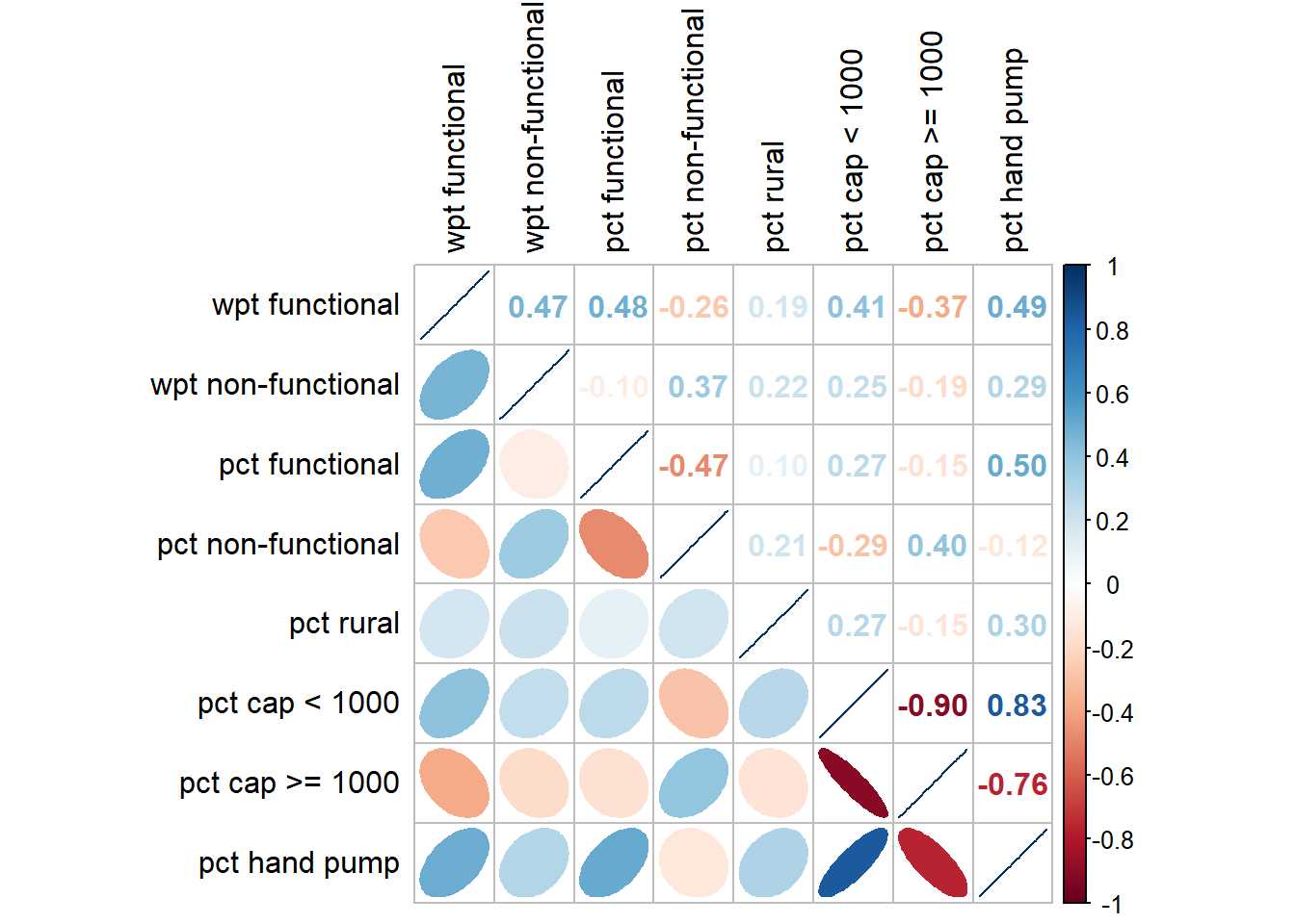
The correlation plot above shows that “pct cap < 1000” and “pct cap >= 1000” are highly correlated. This suggest that only one of them should be used in the cluster analysis instead of both. For this take-home exercise, “pct cap < 1000” is chosen. We will omit “pct cap >= 1000” in the next section.
Selected clustering variables are as follows:
- wpt functional
- wpt non-functional
- pct functional
- pct non-functional
- pct rural
- pct cap < 1000
- pct hand pump
4.1 Hierarchy Cluster Analysis
In this section, you will learn how to perform hierarchical cluster analysis. The analysis consists of four major steps:
4.1.1 Extracting clustering variables
The code chunk below will be used to extract the selected clustering variables from the nga_wp_Ex2 simple feature object into data.frame and also to use column ADM2_CODE as the row index.
cluster_vars <- nga_wp_Ex2_DG
row.names(cluster_vars) <- cluster_vars$"ADM2_CODE"
nga_wp_Ex2_ict <- select(cluster_vars, c(3:8,10))
head(nga_wp_Ex2_ict, 10) wpt functional wpt non-functional pct functional pct non-functional
NGA001001 5 9 0.3125000 0.5625000
NGA001002 32 37 0.4210526 0.4868421
NGA001003 7 7 0.2800000 0.2800000
NGA001004 15 15 0.2500000 0.2500000
NGA001005 13 43 0.1214953 0.4018692
NGA001006 22 31 0.2315789 0.3263158
NGA001007 14 33 0.2456140 0.5789474
NGA001008 25 18 0.3906250 0.2812500
NGA001009 30 117 0.1724138 0.6724138
NGA001010 8 19 0.2051282 0.4871795
pct rural pct cap < 1000 pct hand pump
NGA001001 0.00000000 0.1250000 0.06250000
NGA001002 0.07894737 0.1710526 0.14473684
NGA001003 0.84000000 0.6000000 0.08000000
NGA001004 0.81666667 0.5666667 0.06666667
NGA001005 0.82242991 0.5233645 0.04672897
NGA001006 0.93684211 0.6105263 0.16842105
NGA001007 0.87719298 0.1929825 0.01754386
NGA001008 1.00000000 0.4375000 0.10937500
NGA001009 0.98275862 0.4367816 0.28160920
NGA001010 0.58974359 0.3846154 0.076923084.2 Data Standardisation
In general, multiple variables will be used in cluster analysis. It is not unusual their values range are different. In order to avoid the cluster analysis result is baised to clustering variables with large values, it is useful to standardise the input variables before performing cluster analysis.
Warning: As highlighted Z-score standardisation method will not be used as NOT all variables come are of normal distribution. For this example we will proceed with Min-Max
4.2.1 Min-Max standardisation
In the code chunk below, normalize() of heatmaply package is used to stadardisation the clustering variables by using Min-Max method. The summary() is then used to display the summary statistics of the standardised clustering variables.
nga_wp_Ex2_ict.std <- normalize(nga_wp_Ex2_ict)
summary(nga_wp_Ex2_ict.std) wpt functional wpt non-functional pct functional pct non-functional
Min. :0.00000 Min. :0.00000 Min. :0.0000 Min. :0.0000
1st Qu.:0.02235 1st Qu.:0.04545 1st Qu.:0.3226 1st Qu.:0.2115
Median :0.06285 Median :0.12500 Median :0.4746 Median :0.3514
Mean :0.09421 Mean :0.15779 Mean :0.4983 Mean :0.3600
3rd Qu.:0.12151 3rd Qu.:0.22727 3rd Qu.:0.6802 3rd Qu.:0.5000
Max. :1.00000 Max. :1.00000 Max. :1.0000 Max. :1.0000
pct rural pct cap < 1000 pct hand pump
Min. :0.0000 Min. :0.0000 Min. :0.0000
1st Qu.:0.5826 1st Qu.:0.4118 1st Qu.:0.1875
Median :0.8614 Median :0.6800 Median :0.5147
Mean :0.7288 Mean :0.6138 Mean :0.4943
3rd Qu.:1.0000 3rd Qu.:0.8750 3rd Qu.:0.7805
Max. :1.0000 Max. :1.0000 Max. :1.0000 Notice that the values range of the Min-max standardised clustering variables are 0-1 now.
4.2.2 Visualising the standardised clustering variables
Beside reviewing the summary statistics of the standardised clustering variables, it is also a good practice to visualise their distribution graphical.
The code chunks below plot the scaled wpt functional & wpt non-functional field.
r <- ggplot(data=nga_wp_Ex2,
aes(x= `wpt functional`)) +
geom_histogram(bins=20,
color="black",
fill="light blue") +
ggtitle("Raw values without\nstandardisation")nga_wp_Ex2_ict_std_df <- as.data.frame(nga_wp_Ex2_ict.std)
s <- ggplot(data=nga_wp_Ex2_ict_std_df,
aes(x=`wpt functional`)) +
geom_histogram(bins=20,
color="black",
fill="light blue") +
ggtitle("Min-Max\nStandardisation")r + s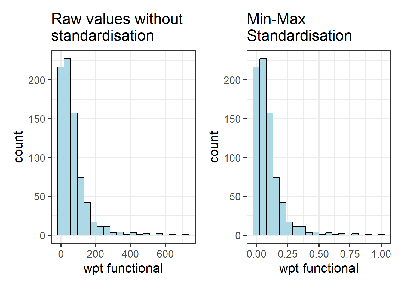
Notice that the x-values have been standardised so that they fall between 0 to 1.
5.1 Computing proximity matrix
In R, many packages provide functions to calculate distance matrix. We will compute the proximity matrix by using dist() of R.
dist() supports six distance proximity calculations, they are: euclidean, maximum, manhattan, canberra, binary and minkowski. The default is euclidean proximity matrix.
The code chunk below is used to compute the proximity matrix using euclidean method.
proxmat <- dist(nga_wp_Ex2_ict, method = 'euclidean')
proxmat5.1.1 Computing hierarchical clustering (Non-spatially constrained clustering)
In R, there are several packages provide hierarchical clustering function. In this hands-on exercise, hclust() of R stats will be used.
hclust() employed agglomeration method to compute the cluster. Eight clustering algorithms are supported, they are: ward.D, ward.D2, single, complete, average(UPGMA), mcquitty(WPGMA), median(WPGMC) and centroid(UPGMC).
The code chunk below performs hierarchical cluster analysis using ward.D method. The hierarchical clustering output is stored in an object of class hclust which describes the tree produced by the clustering process.
hclust_ward <- hclust(proxmat, method = 'ward.D')We can then plot the tree by using plot() of R Graphics as shown in the code chunk below.
plot(hclust_ward, cex = 0.05)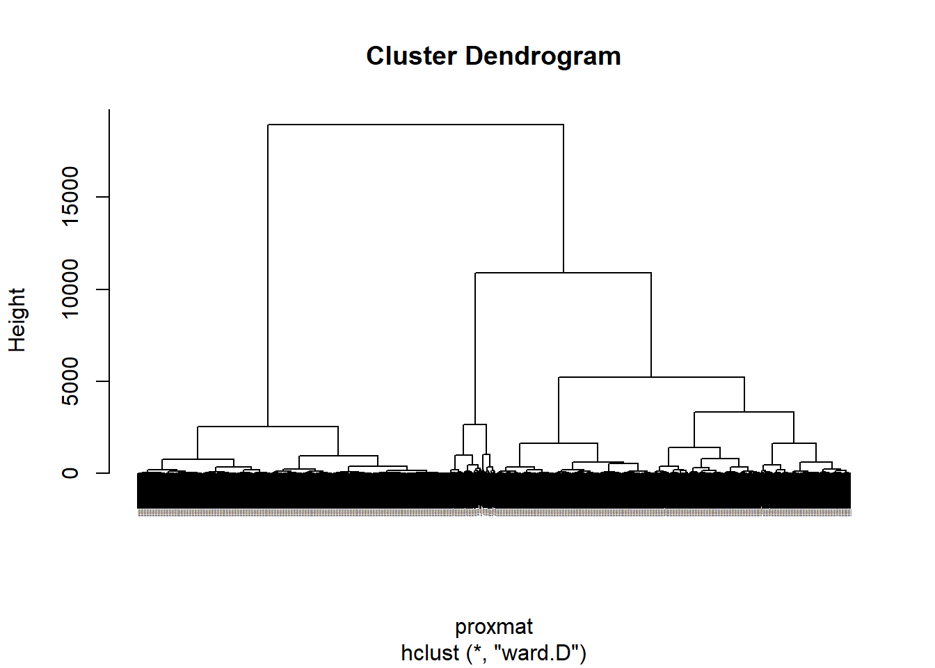
5.1.2 Selecting the optimal clustering algorithm
One of the challenge in performing hierarchical clustering is to identify stronger clustering structures. The issue can be solved by using use agnes() function of cluster package. It functions like hclus(), however, with the agnes() function you can also get the agglomerative coefficient, which measures the amount of clustering structure found (values closer to 1 suggest strong clustering structure).
The code chunk below will be used to compute the agglomerative coefficients of all hierarchical clustering algorithms.
m <- c( "average", "single", "complete", "ward")
names(m) <- c( "average", "single", "complete", "ward")
ac <- function(x) {
agnes(nga_wp_Ex2_ict, method = x)$ac
}
map_dbl(m, ac) average single complete ward
0.9922221 0.9670021 0.9935483 0.9980725 With reference to the output above, we can see that Ward’s method provides the strongest clustering structure among the four methods assessed. Hence, in the subsequent analysis, only Ward’s method will be used.
5.1.3 Determining Optimal Clusters
Another technical challenge face by data analyst in performing clustering analysis is to determine the optimal clusters to retain.
There are three commonly used methods to determine the optimal clusters, they are:
5.1.3.1 Gap Statistic Method
The gap statistic compares the total within intra-cluster variation for different values of k with their expected values under null reference distribution of the data. The estimate of the optimal clusters will be value that maximize the gap statistic (i.e., that yields the largest gap statistic). This means that the clustering structure is far away from the random uniform distribution of points.
To compute the gap statistic, clusGap() of cluster package will be used.
set.seed(12345)
gap_stat <- clusGap(nga_wp_Ex2_ict,
FUN = hcut,
nstart = 25,
K.max = 10,
B = 50)
# Print the result
print(gap_stat, method = "firstmax")Clustering Gap statistic ["clusGap"] from call:
clusGap(x = nga_wp_Ex2_ict, FUNcluster = hcut, K.max = 10, B = 50, nstart = 25)
B=50 simulated reference sets, k = 1..10; spaceH0="scaledPCA"
--> Number of clusters (method 'firstmax'): 1
logW E.logW gap SE.sim
[1,] 9.759796 10.879617 1.1198209 0.01454078
[2,] 9.532971 10.426413 0.8934415 0.03881546
[3,] 9.178684 10.211475 1.0327914 0.02516053
[4,] 9.126162 10.088090 0.9619282 0.01713119
[5,] 9.006787 9.985733 0.9789458 0.01307360
[6,] 8.895835 9.891464 0.9956289 0.01286276
[7,] 8.840645 9.805948 0.9653024 0.01459348
[8,] 8.773782 9.728964 0.9551814 0.01791584
[9,] 8.747021 9.661292 0.9142709 0.01850749
[10,] 8.638142 9.602217 0.9640758 0.01750828fviz_gap_stat(gap_stat)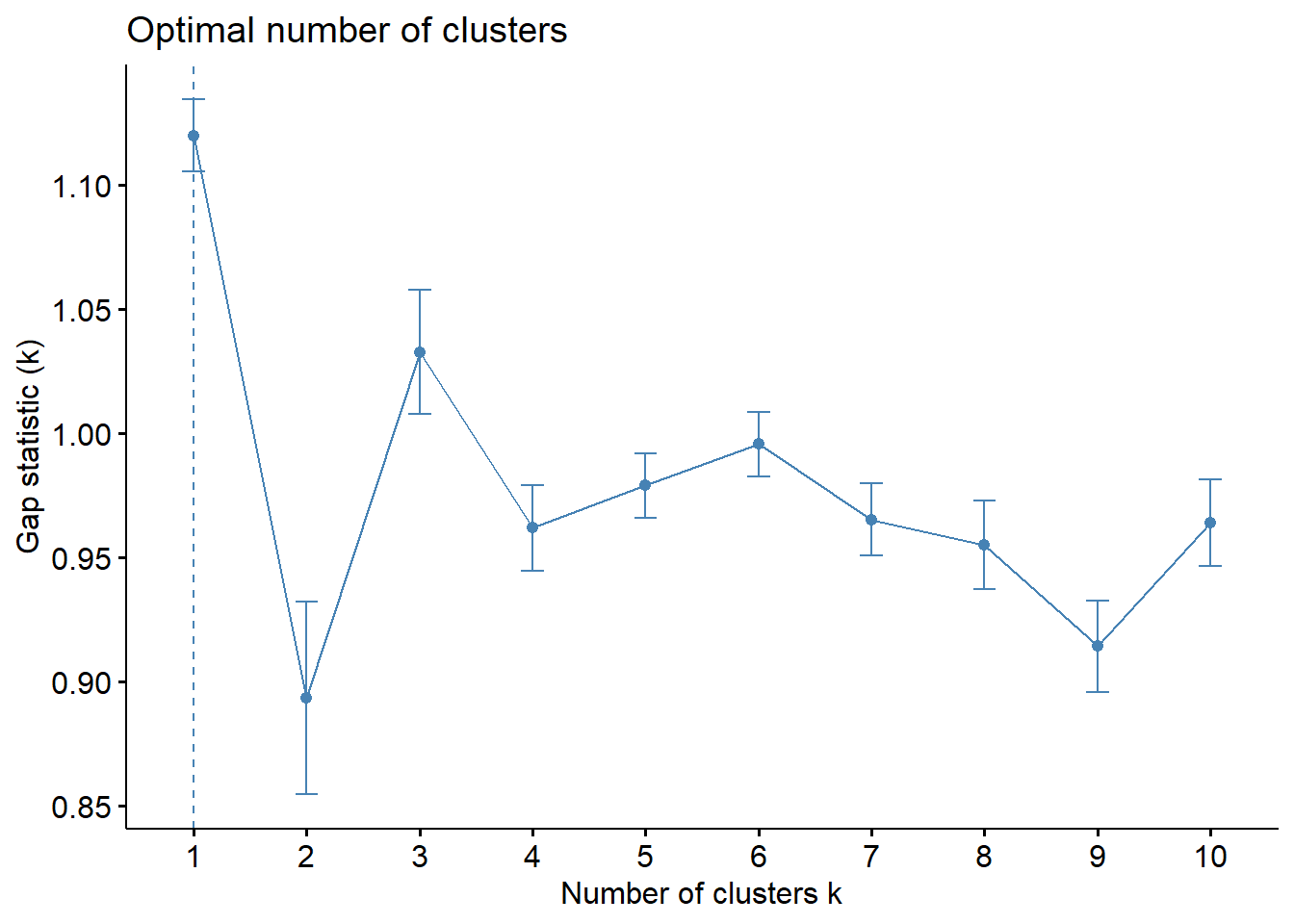
With reference to the gap statistic graph above, the recommended number of cluster to retain is 1. However, it is not logical to retain only one cluster. By examine the gap statistic graph, the 3-cluster gives the largest gap statistic and should be the next best cluster to pick.
Note: In addition to these commonly used approaches, the NbClust package, published by Charrad et al., 2014, provides 30 indices for determining the relevant number of clusters and proposes to users the best clustering scheme from the different results obtained by varying all combinations of number of clusters, distance measures, and clustering methods.
5.1.4 Interpreting the dendrograms
In the dendrogram displayed above, each leaf corresponds to one observation. As we move up the tree, observations that are similar to each other are combined into branches, which are themselves fused at a higher height.
The height of the fusion, provided on the vertical axis, indicates the (dis)similarity between two observations. The higher the height of the fusion, the less similar the observations are. Note that, conclusions about the proximity of two observations can be drawn only based on the height where branches containing those two observations first are fused. We cannot use the proximity of two observations along the horizontal axis as a criteria of their similarity.
It’s also possible to draw the dendrogram with a border around the selected clusters by using rect.hclust() of R stats. The argument border is used to specify the border colors for the rectangles.
plot(hclust_ward, cex = 0.1)
rect.hclust(hclust_ward,
k = 3,
border = 2:5)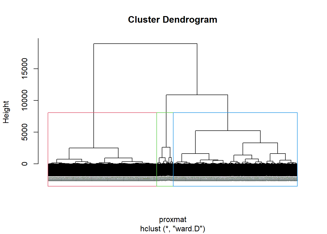
5.1.5 Visually-driven hierarchical clustering analysis
In this section, we will learn how to perform visually-driven hiearchical clustering analysis by using heatmaply package.
With heatmaply, we are able to build both highly interactive cluster heatmap or static cluster heatmap.
5.1.5.1 Transforming the data frame into a matrix
The data was loaded into a data frame, but it has to be a data matrix to make your heatmap.
The code chunk below will be used to transform nga_wp_Ex2_ict data frame into a data matrix.
nga_wp_Ex2_ict_mat <- data.matrix(nga_wp_Ex2_ict)heatmaply(normalize(nga_wp_Ex2_ict_mat),
Colv=NA,
dist_method = "euclidean",
hclust_method = "ward.D",
seriate = "OLO",
colors = Blues,
k_row = 3,
margins = c(NA,200,60,NA),
fontsize_row = 4,
fontsize_col = 5,
main="Geographic Segmentation of Nigeria Local Government Area by WPT indicators",
xlab = "WPT indicators",
ylab = "Nigeria Local Government Area")Cluster 3 has the highest pct functional, highest pct cap < 1000, and highest pct hand pump in the Nigeria Local Government Area level.
5.1.6 Mapping the clusters formed
With closed examination of the dendragram above, we have decided to retain three (3) clusters.
cutree() of R Base will be used in the code chunk below to derive a 6-cluster model.
groups <- as.factor(cutree(hclust_ward, k=3))The output is called groups. It is a list object.
In order to visualise the clusters, the groups object need to be appended onto nga_wp_Ex2 simple feature object.
The code chunk below form the join in three steps:
the groups list object will be converted into a matrix;
cbind() is used to append groups matrix onto nga_wp_Ex2 to produce an output simple feature object called
nga_wp_Ex2_cluster; andrename of dplyr package is used to rename as.matrix.groups field as CLUSTER.
nga_wp_Ex2_cluster <- cbind(nga_wp_Ex2, as.matrix(groups)) %>%
rename(`CLUSTER`=`as.matrix.groups.`)Next, qtm() of tmap package is used to plot the choropleth map showing the cluster formed.
qtm(nga_wp_Ex2_cluster, "CLUSTER")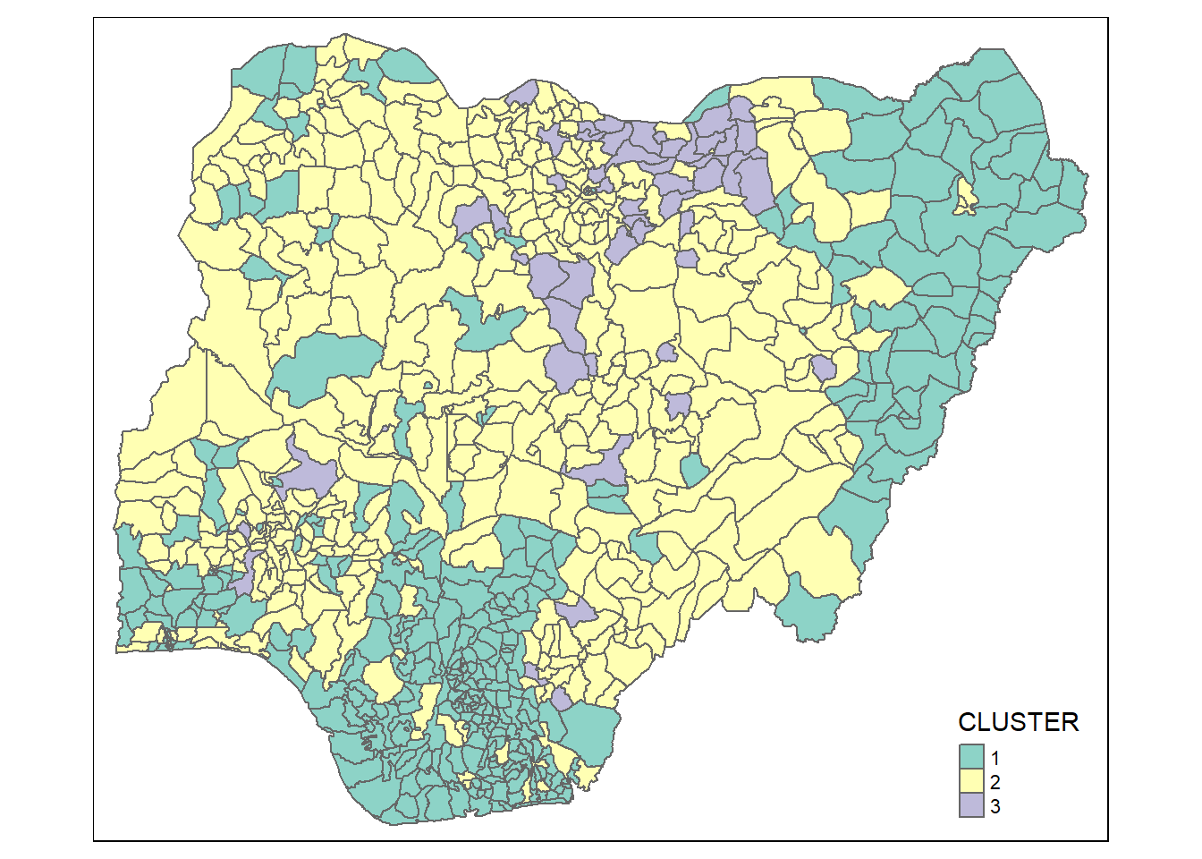
The choropleth map above reveals the clusters are very fragmented. The is one of the major limitation when non-spatial clustering algorithm such as hierarchical cluster analysis method is used.
5.2 Spatially Constrained Clustering: SKATER approach
In this section, you will learn how to derive spatially constrained cluster by using skater() method of spdep package.
5.2.1 Converting into SpatialPolygonsDataFrame
First, we need to convert nga_wp_Ex2 into SpatialPolygonsDataFrame. This is because SKATER function only support sp objects such as SpatialPolygonDataFrame.
The code chunk below uses as_Spatial() of sf package to convert nga_wp_Ex2 into a SpatialPolygonDataFrame called nga_wp_Ex2_sp.
nga_wp_Ex2_sp <- as_Spatial(nga_wp_Ex2)5.2.2 Computing Neighbour List
Next, poly2nd() of spdep package will be used to compute the neighbours list from polygon list.
nga_wp_Ex2.nb <- poly2nb(nga_wp_Ex2_sp)
summary(nga_wp_Ex2.nb)Neighbour list object:
Number of regions: 773
Number of nonzero links: 4484
Percentage nonzero weights: 0.7504238
Average number of links: 5.800776
Link number distribution:
1 2 3 4 5 6 7 8 9 10 11 12 13
2 13 53 117 178 156 121 71 41 15 4 1 1
2 least connected regions:
475 505 with 1 link
1 most connected region:
516 with 13 linksWe can plot the neighbours list on nga_wp_Ex2_sp by using the code chunk below. Since we now can plot the community area boundaries as well, we plot this graph on top of the map. The first plot command gives the boundaries. This is followed by the plot of the neighbor list object, with coordinates applied to the original SpatialPolygonDataFrame (Nigeria Local Government Area boundaries) to extract the centroids of the polygons. These are used as the nodes for the graph representation. We also set the color to blue and specify add=TRUE to plot the network on top of the boundaries.
plot(nga_wp_Ex2_sp,
border=grey(.5))
plot(nga_wp_Ex2.nb,
coordinates(nga_wp_Ex2_sp),
col="blue",
add=TRUE)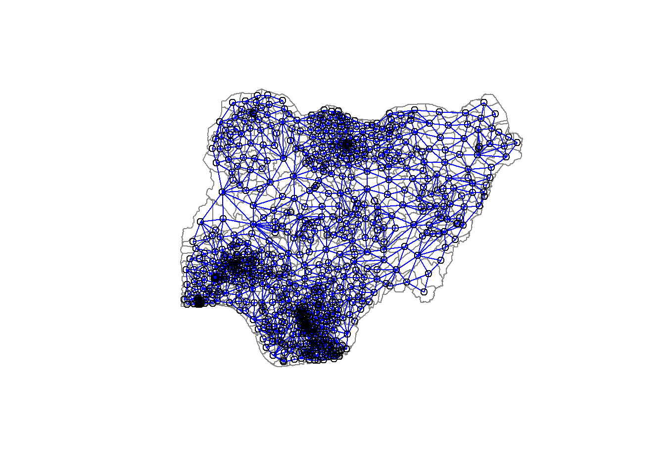
Note that if you plot the network first and then the boundaries, some of the areas will be clipped. This is because the plotting area is determined by the characteristics of the first plot. In this example, because the boundary map extends further than the graph, we plot it first.
5.2.3 Computing minimum spanning tree
5.2.3.1 Calculating edge costs
Next, nbcosts() of spdep package is used to compute the cost of each edge. It is the distance between it nodes. This function compute this distance using a data.frame with observations vector in each node.
The code chunk below is used to compute the cost of each edge.
lcosts <- nbcosts(nga_wp_Ex2.nb, nga_wp_Ex2_ict)For each observation, this gives the pairwise dissimilarity between its values on the five variables and the values for the neighbouring observation (from the neighbour list). Basically, this is the notion of a generalised weight for a spatial weights matrix.
Next, We will incorporate these costs into a weights object in the same way as we did in the calculation of inverse of distance weights. In other words, we convert the neighbour list to a list weights object by specifying the just computed lcosts as the weights.
In order to achieve this, nb2listw() of spdep package is used as shown in the code chunk below.
Note that we specify the style as B to make sure the cost values are not row-standardised.
nga_wp_Ex2.w <- nb2listw(nga_wp_Ex2.nb,
lcosts,
style="B")Warning in nb2listw(nga_wp_Ex2.nb, lcosts, style = "B"): zero sum general
weightssummary(nga_wp_Ex2.w)Characteristics of weights list object:
Neighbour list object:
Number of regions: 773
Number of nonzero links: 4484
Percentage nonzero weights: 0.7504238
Average number of links: 5.800776
Link number distribution:
1 2 3 4 5 6 7 8 9 10 11 12 13
2 13 53 117 178 156 121 71 41 15 4 1 1
2 least connected regions:
475 505 with 1 link
1 most connected region:
516 with 13 links
Weights style: B
Weights constants summary:
n nn S0 S1 S2
B 773 597529 264324.9 70899855 7063303025.2.4 Computing minimum spanning tree
The minimum spanning tree is computed by mean of the mstree() of spdep package as shown in the code chunk below.
nga_wp_Ex2.mst <- mstree(nga_wp_Ex2.w)After computing the MST, we can check its class and dimension by using the code chunk below.
class(nga_wp_Ex2.mst)[1] "mst" "matrix"dim(nga_wp_Ex2.mst)[1] 772 3Note that the dimension is 772 and not 773. This is because the minimum spanning tree consists on n-1 edges (links) in order to traverse all the nodes.
We can display the content of nga_wp_Ex2.mst by using head() as shown in the code chunk below.
head(nga_wp_Ex2.mst) [,1] [,2] [,3]
[1,] 182 173 47.38331
[2,] 173 170 13.34193
[3,] 173 169 23.34723
[4,] 169 217 15.82093
[5,] 169 212 33.97151
[6,] 212 221 21.95609The plot method for the MST include a way to show the observation numbers of the nodes in addition to the edge. As before, we plot this together with the township boundaries. We can see how the initial neighbour list is simplified to just one edge connecting each of the nodes, while passing through all the nodes.
plot(nga_wp_Ex2_sp, border=gray(.5))
plot.mst(nga_wp_Ex2.mst,
coordinates(nga_wp_Ex2_sp),
col="blue",
cex.lab=0.7,
cex.circles=0.005,
add=TRUE)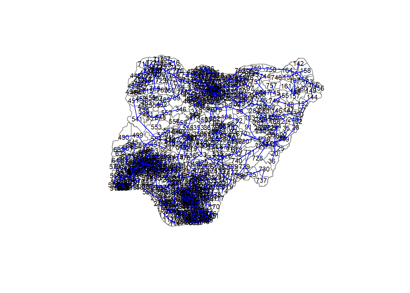
5.2.5 Computing spatially constrained clusters using SKATER method
The code chunk below compute the spatially constrained cluster using skater() of spdep package.
clust3 <- spdep::skater(edges = nga_wp_Ex2.mst[,1:2],
data = nga_wp_Ex2_ict,
method = "euclidean",
ncuts = 2)The skater() takes three mandatory arguments: - the first two columns of the MST matrix (i.e. not the cost), - the data matrix (to update the costs as units are being grouped), and - the number of cuts. Note: It is set to one less than the number of clusters. So, the value specified is not the number of clusters, but the number of cuts in the graph, one less than the number of clusters.
The result of the skater() is an object of class skater. We can examine its contents by using the code chunk below.
str(clust3)List of 8
$ groups : num [1:773] 1 1 1 1 1 1 1 1 1 1 ...
$ edges.groups:List of 3
..$ :List of 3
.. ..$ node: num [1:207] 474 473 228 186 187 200 86 79 80 84 ...
.. ..$ edge: num [1:206, 1:3] 173 213 240 229 173 10 226 17 227 43 ...
.. ..$ ssw : num 4401
..$ :List of 3
.. ..$ node: num [1:558] 398 378 329 98 322 324 407 754 746 95 ...
.. ..$ edge: num [1:557, 1:3] 754 746 750 95 94 749 148 98 329 322 ...
.. ..$ ssw : num 35216
..$ :List of 3
.. ..$ node: num [1:8] 326 325 343 334 320 319 321 344
.. ..$ edge: num [1:7, 1:3] 343 326 325 334 334 334 325 320 325 334 ...
.. ..$ ssw : num 860
$ not.prune : NULL
$ candidates : int [1:3] 1 2 3
$ ssto : num 49860
$ ssw : num [1:3] 49860 43984 40476
$ crit : num [1:2] 1 Inf
$ vec.crit : num [1:773] 1 1 1 1 1 1 1 1 1 1 ...
- attr(*, "class")= chr "skater"The most interesting component of this list structure is the groups vector containing the labels of the cluster to which each observation belongs (as before, the label itself is arbitary). This is followed by a detailed summary for each of the clusters in the edges.groups list. Sum of squares measures are given as ssto for the total and ssw to show the effect of each of the cuts on the overall criterion.
We can check the cluster assignment by using the conde chunk below.
ccs3 <- clust3$groups
ccs3 [1] 1 1 1 1 1 1 1 1 1 1 1 1 1 1 1 1 1 2 2 2 2 2 2 2 2 2 2 2 2 2 2 2 2 2 2 2 2
[38] 2 1 1 1 1 1 1 1 1 1 1 1 1 1 1 1 1 1 1 1 1 1 1 1 1 1 1 1 1 1 1 1 1 1 1 1 1
[75] 1 1 1 1 1 1 1 1 1 1 1 1 1 1 1 1 2 2 2 2 2 2 2 2 2 2 2 2 2 2 2 2 2 2 2 2 1
[112] 1 1 1 1 1 1 1 2 2 2 2 2 2 2 2 2 2 2 2 2 2 2 2 2 2 2 2 2 2 2 2 2 2 2 2 2 2
[149] 2 2 2 2 2 2 2 2 2 2 2 2 2 2 2 2 2 2 2 2 1 1 1 2 1 2 1 1 2 2 2 2 2 1 2 2 2
[186] 1 1 1 1 1 1 1 1 1 1 1 1 1 1 1 1 1 1 1 1 1 1 1 1 1 2 1 1 2 2 2 1 2 1 2 1 2
[223] 2 2 1 1 1 1 1 2 2 2 1 1 1 1 1 1 2 1 1 2 2 2 2 2 2 1 2 2 1 2 2 2 1 2 2 1 1
[260] 1 1 1 1 1 1 1 2 1 1 1 1 1 1 1 2 2 2 2 2 2 2 2 2 2 2 2 2 2 2 2 2 1 1 1 1 1
[297] 1 1 1 1 1 1 1 1 1 1 1 1 1 1 1 1 1 1 1 1 1 1 3 3 3 2 2 2 3 3 2 2 2 2 2 2 2
[334] 3 2 2 2 2 2 2 2 2 3 3 2 2 2 2 2 2 2 2 2 2 2 2 2 2 2 2 2 2 2 2 2 2 2 2 2 2
[371] 2 2 2 2 2 2 2 2 2 2 2 2 2 2 2 2 2 2 2 2 2 2 2 2 2 2 2 2 2 2 2 2 2 2 2 2 2
[408] 2 2 2 2 2 2 2 2 2 2 2 2 2 2 2 2 2 2 2 2 2 2 2 2 2 2 2 2 2 2 2 2 2 2 2 2 2
[445] 2 2 2 2 2 2 2 2 2 2 2 2 2 2 2 2 2 2 2 2 2 2 2 2 2 2 2 2 1 1 2 2 2 2 2 2 2
[482] 2 2 2 2 2 2 2 2 2 2 2 2 2 2 2 2 2 2 2 2 2 2 2 2 2 2 2 2 2 2 2 2 2 2 2 2 2
[519] 2 2 2 2 2 2 2 2 2 2 2 2 2 2 2 2 2 2 2 2 2 2 2 2 2 2 2 2 2 2 2 2 2 2 2 2 2
[556] 2 2 2 2 2 2 2 2 2 2 2 2 2 2 2 2 2 2 2 2 2 2 2 2 1 2 2 2 2 2 2 1 1 1 1 2 1
[593] 2 1 2 1 1 2 2 2 2 2 2 2 2 2 2 2 2 2 2 2 2 2 2 2 2 2 2 2 2 2 2 2 2 2 2 2 2
[630] 2 2 2 2 2 2 2 2 2 2 2 2 2 2 2 2 2 2 2 2 2 2 2 2 2 2 2 2 2 2 2 2 2 2 2 2 2
[667] 2 2 2 2 2 2 2 2 2 2 2 2 2 2 1 1 1 1 1 1 1 1 1 1 1 1 1 1 1 1 1 1 1 1 1 1 1
[704] 2 2 2 2 2 2 2 2 2 2 2 2 2 2 2 2 2 2 2 2 2 2 2 2 2 2 2 2 2 2 2 2 2 2 2 2 2
[741] 2 2 2 2 2 2 2 2 2 2 2 2 2 2 2 2 2 2 2 2 2 2 2 2 2 2 2 2 2 2 2 2 2We can find out how many observations are in each cluster by means of the table command. Parenthetially, we can also find this as the dimension of each vector in the lists contained in edges.groups. For example, the first list has node with dimension 207, which is also the number of observations in the first cluster.
table(ccs3)ccs3
1 2 3
207 558 8 Lastly, we can also plot the pruned tree that shows the three clusters on top of Nigeria Local Government Area.
plot(nga_wp_Ex2_sp, border=gray(.5))
plot(clust3,
coordinates(nga_wp_Ex2_sp),
cex.lab=.7,
groups.colors=c("red","green","blue", "brown", "pink"),
cex.circles=0.005,
add=TRUE)Warning in segments(coords[id1, 1], coords[id1, 2], coords[id2, 1],
coords[id2, : "add" is not a graphical parameter
Warning in segments(coords[id1, 1], coords[id1, 2], coords[id2, 1],
coords[id2, : "add" is not a graphical parameter
Warning in segments(coords[id1, 1], coords[id1, 2], coords[id2, 1],
coords[id2, : "add" is not a graphical parameter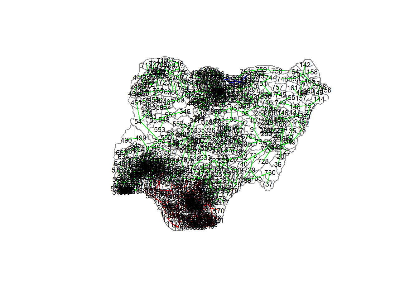
5.2.6 Visualising the clusters in choropleth map
The code chunk below is used to plot the newly derived clusters by using SKATER method.
tmap_mode("view")tmap mode set to interactive viewinggroups_mat <- as.matrix(clust3$groups)
nga_wp_Ex2_spatialcluster <- cbind(nga_wp_Ex2_cluster, as.factor(groups_mat)) %>%
rename(`SP_CLUSTER`=`as.factor.groups_mat.`)
qtm(nga_wp_Ex2_spatialcluster, "SP_CLUSTER") +
tm_view(set.zoom.limits = c(5,10))5.3 Spatially Constrained Clustering: ClustGeo Method
In this section, you will gain hands-on experience on using functions provided by ClustGeo package to perform non-spatially constrained hierarchical cluster analysis and spatially constrained cluster analysis.
5.3.1 A short note about ClustGeo package
ClustGeo package is an R package specially designed to support the need of performing spatially constrained cluster analysis. More specifically, it provides a Ward-like hierarchical clustering algorithm called hclustgeo() including spatial/geographical constraints.
In the nutshell, the algorithm uses two dissimilarity matrices D0 and D1 along with a mixing parameter alpha, whereby the value of alpha must be a real number between [0, 1]. D0 can be non-Euclidean and the weights of the observations can be non-uniform. It gives the dissimilarities in the attribute/clustering variable space. D1, on the other hand, gives the dissimilarities in the constraint space. The criterion minimised at each stage is a convex combination of the homogeneity criterion calculated with D0 and the homogeneity criterion calculated with D1.
The idea is then to determine a value of alpha which increases the spatial contiguity without deteriorating too much the quality of the solution based on the variables of interest. This need is supported by a function called choicealpha().
5.3.2 Ward-like hierarchical clustering: ClustGeo
ClustGeo package provides function called hclustgeo() to perform a typical Ward-like hierarchical clustering just like hclust() you learned in previous section.
To perform non-spatially constrained hierarchical clustering, we only need to provide the function a dissimilarity matrix as shown in the code chunk below.
nongeo_cluster <- hclustgeo(proxmat)
plot(nongeo_cluster, cex = 0.5)
rect.hclust(nongeo_cluster,
k = 3,
border = 2:5)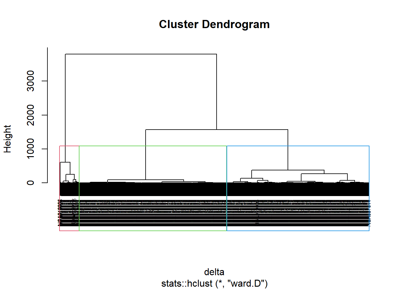
Note that the dissimilarity matrix must be an object of class dist, i.e. an object obtained with the function dist(). For sample code chunk, please refer to 5.7.6 Computing proximity matrix
5.3.2.1 Mapping the clusters formed
Similarly, we can plot the clusters on a categorical area shaded map by using the steps we learned in 5.7.12 Mapping the clusters formed.
groups <- as.factor(cutree(nongeo_cluster, k=3))nga_wp_Ex2_ngeo_cluster <- cbind(nga_wp_Ex2, as.matrix(groups)) %>%
rename(`CLUSTER` = `as.matrix.groups.`)qtm(nga_wp_Ex2_ngeo_cluster, "CLUSTER")5.3.3 Spatially Constrained Hierarchical Clustering
Before we can performed spatially constrained hierarchical clustering, a spatial distance matrix will be derived by using st_distance() of sf package.
dist <- st_distance(nga_wp_Ex2, nga_wp_Ex2)
distmat <- as.dist(dist)Notice that as.dist() is used to convert the data frame into matrix.
Next, choicealpha() will be used to determine a suitable value for the mixing parameter alpha as shown in the code chunk below. Take note of K, it must be uppercase.
cr <- choicealpha(proxmat, distmat, range.alpha = seq(0, 1, 0.1), K=3, graph = )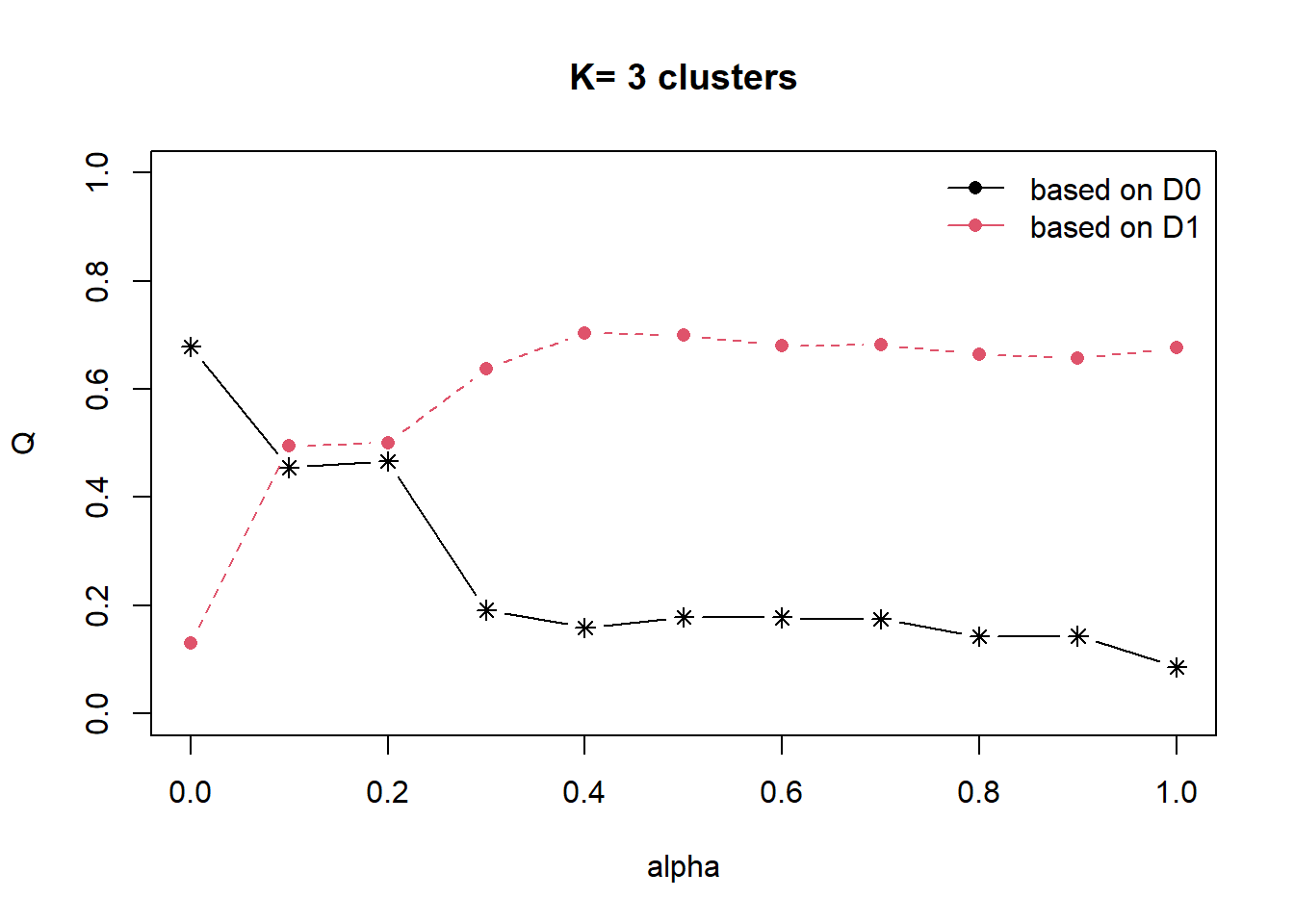
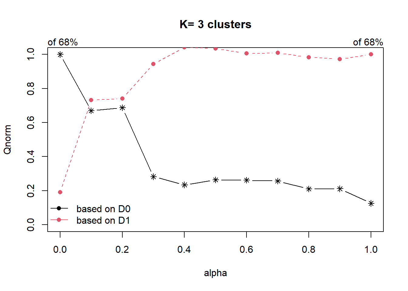
With reference to the graphs above, alpha = 0.2 will be used as shown in the code chunk below. Reason for choosing is that we do not sacrifice too much variables homogeneity for spatial homogeneity.
clustG <- hclustgeo(proxmat, distmat, alpha = 0.2)Next, cutree() is used to derive the cluster object.
groups <- as.factor(cutree(clustG, k=3))We will then join back the group list with nga_wp_Ex2 polygon feature data frame by using the code chunk below.
nga_wp_Ex2_Gcluster <- cbind(nga_wp_Ex2, as.matrix(groups)) %>%
rename(`CLUSTER` = `as.matrix.groups.`)We can now plot the map of the newly delineated spatially constrained clusters.
qtm(nga_wp_Ex2_Gcluster, "CLUSTER")5.4 Visual Interpretation of Clusters
5.4.1 Visualising individual clustering variable
Code chunk below is used to reveal the distribution of a clustering variable (i.e pct.rural) by cluster.
ggplot(data = nga_wp_Ex2_Gcluster,
aes(x = CLUSTER, y = pct.rural)) +
geom_boxplot()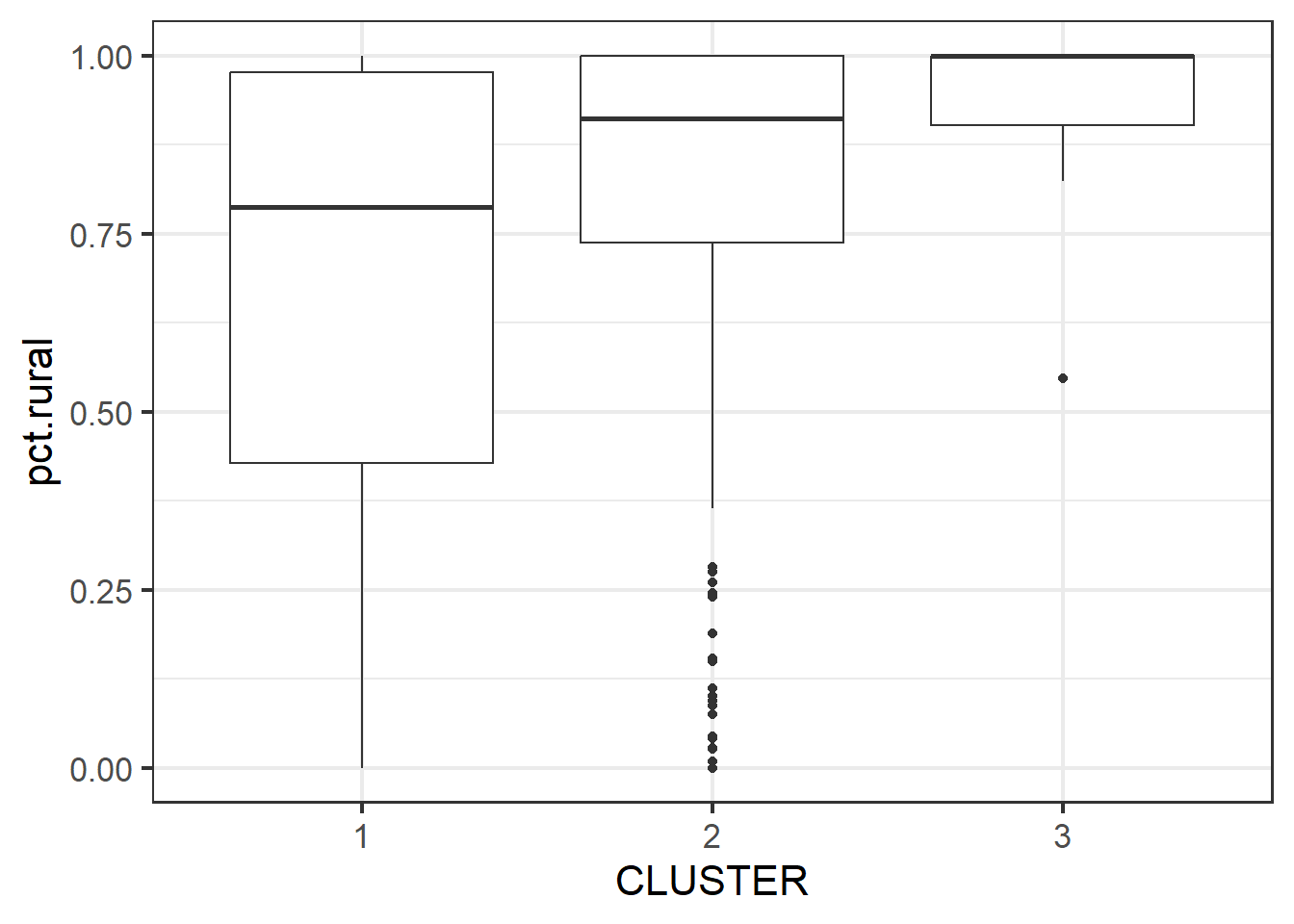
The boxplot reveals Cluster 3 displays the highest pct rural. This is followed by Cluster 2, and lastly 1.
5.4.2 Multivariate Visualisation
Past studies shown that parallel coordinate plot can be used to reveal clustering variables by cluster very effectively. In the code chunk below, ggparcoord() of GGally package.
nga_wp_Ex2_ngeo_cluster2 <- select(nga_wp_Ex2_ngeo_cluster, c(3:8,10:11))ggparcoord_nga <- ggparcoord(data = nga_wp_Ex2_ngeo_cluster2,
columns = c(1:7),
scale = "std",
alphaLines = 0.2,
boxplot = TRUE,
title = "Multiple Parallel Coordinates Plots of Clustering Variables by Cluster") +
facet_grid(~ CLUSTER) +
theme(plot.title = element_text(size=10),
axis.text.x = element_text(size = 8))
ggparcoord_nga + theme(axis.text.x = element_text(angle = 90, vjust = 0.5, hjust=1))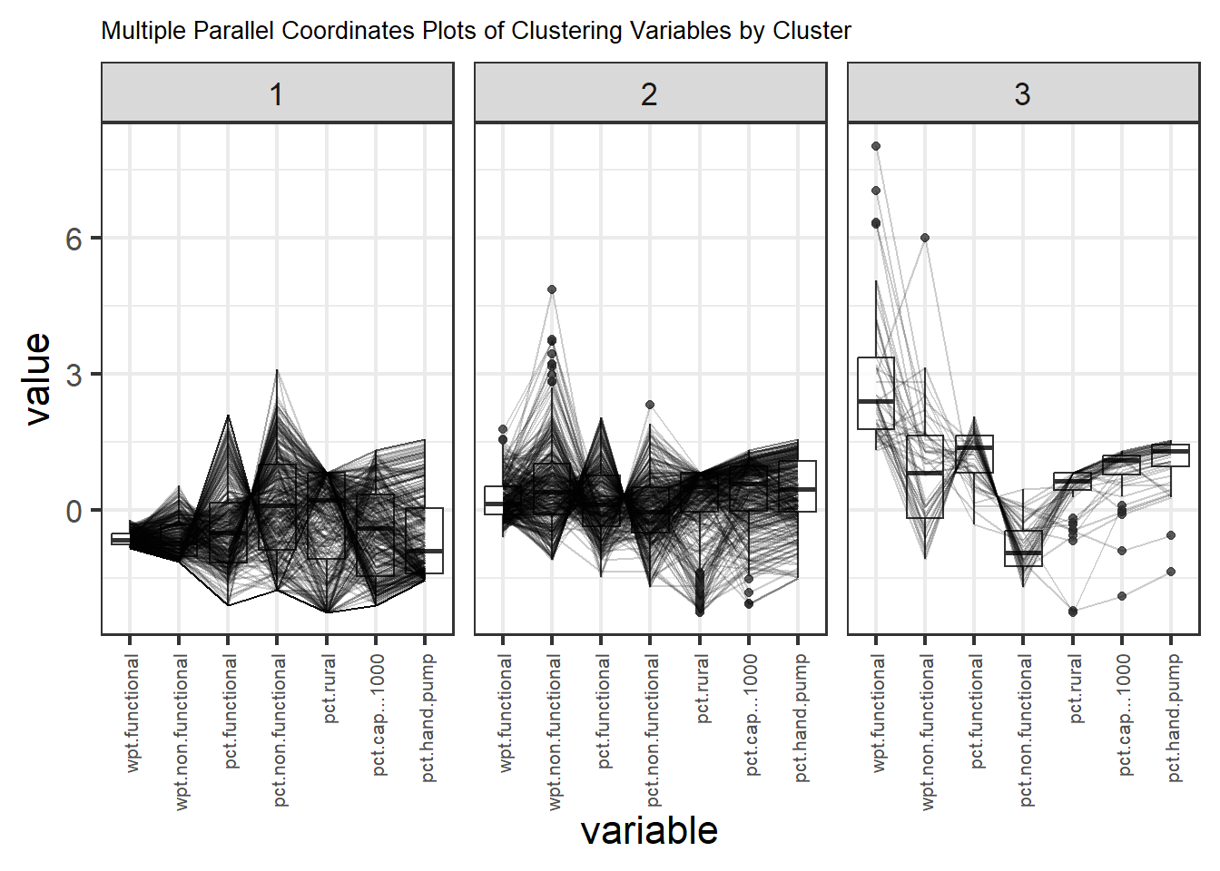
The parallel coordinate plot above reveals that LGAs in Cluster 3’s while having the highest average number of wpt functional also have the highest average pct wpt functional. Cluster 3 has the highest average “pct cap < 1000”, this is inline with them having the highest average “pct hand pump”. Hand pump usually have smaller capacity and have less components leading to lesser failures as compared to mechanical pump.
Note that the scale argument of ggparcoor() provide several methods to scale the clustering variables. They are:
std: univariately, subtract mean and divide by standard deviation.
robust: univariately, subtract median and divide by median absolute deviation.
uniminmax: univariately, scale so the minimum of the variable is zero, and the maximum is one.
globalminmax: no scaling is done; the range of the graphs is defined by the global minimum and the global maximum.
center: use uniminmax to standardize vertical height, then center each variable at a value specified by the scaleSummary param.
centerObs: use uniminmax to standardize vertical height, then center each variable at the value of the observation specified by the centerObsID param
There is no one best scaling method to use. You should explore them and select the one that best meet your analysis need.
Last but not least, we can also compute the summary statistics such as mean, median, sd, etc to complement the visual interpretation.
In the code chunk below, group_by() and summarise() of dplyr are used to derive mean values of the clustering variables.
nga_wp_Ex2_ngeo_cluster %>%
st_set_geometry(NULL) %>%
group_by(CLUSTER) %>%
summarise(mean_FUNC = mean(wpt.functional),
mean_NONFUNC = mean(wpt.non.functional),
mean_PCTFUNC = mean(pct.functional),
mean_PCTNONFUNC = mean(pct.non.functional),
mean_PCTRURAL = mean(pct.rural),
mean_PCTCAPLESS1000 = mean(pct.cap...1000),
mean_PCTHANDPUMP = mean(pct.hand.pump))# A tibble: 3 × 8
CLUSTER mean_FUNC mean_NONFUNC mean_PCTFUNC mean_PCT…¹ mean_…² mean_…³ mean_…⁴
<chr> <dbl> <dbl> <dbl> <dbl> <dbl> <dbl> <dbl>
1 1 17.3 18.4 0.409 0.380 0.653 0.470 0.308
2 2 87.0 61.4 0.550 0.363 0.788 0.728 0.638
3 3 302. 73 0.795 0.187 0.866 0.866 0.844
# … with abbreviated variable names ¹mean_PCTNONFUNC, ²mean_PCTRURAL,
# ³mean_PCTCAPLESS1000, ⁴mean_PCTHANDPUMP